 When a major auto firm decides to build a concept, it first establishes a strategy and settles on the goals for the design. People always ask, “Why do they make concept cars?” There are a lot of reasons that range from exploring new packaging and technologies, to generating interest and gauging public reaction, to ‘preparing’ the public for future forms, to merely “exercising” or rewarding their design department. Of course, they often release statements as to their reasons, but, I’d suggest that those be taken with grains of salt.
No firm is adverse to attention, and a sizzling show car can generate quite the buzz. Even though most show cars we see are million dollar one of a kind works of art, the expense to build them is often cheap compared to advertising budgets. So, bang for the buck is high. But it’s not without risk. At the Detroit Auto Show recently, Chevrolet unveiled two concepts, and neither was viewed as exactly home runs. In fact, one was considered to be a bit of a flop. Still, ANY publicity is good publicity.
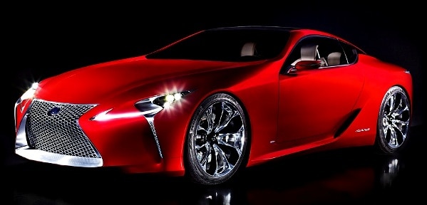
Lets take a closer look at the Lexus LF LC concept that was unveiled to the “Oooos” and “Aahhhs” of the collected media.
Up front, I’ll tip my hat: I think this is the most cohesive, interesting and important thing I’ve seen from Lexus. It’s a great example of how simple elements can add up to a whole that is far more then the sum of it’s parts. There’s really nothing earthshaking or groundbreaking about it all. Actually, it’s rather conventional! No pontoon fenders or wild doors on hinges that pop up and open like air brakes. It has four wheels, in the usual places. Compared to the recent BMW i concept series cars, it’s downright boring.
Well, not really. While it lacks “wow” features, it’s the overall impact that wows viewers. Of course, it’s not a production car. Too low, too wide, too tight fender clearance, and too likely to scrape it’s nose on anything but the highway. Where it shines is in the basics, and the visual delights of it’s complex forms and thematic detailing. I spoke with an old friend from my days at a California design firm, Mark West, who was on the Eyes on Design judging panel. We agreed: stance, proportion and surface resolution were the elements that formed the foundation that make this an award winner. But the interesting sculptural forms, and tasty detailing put it over the top.
Lets examine some details and specifics.
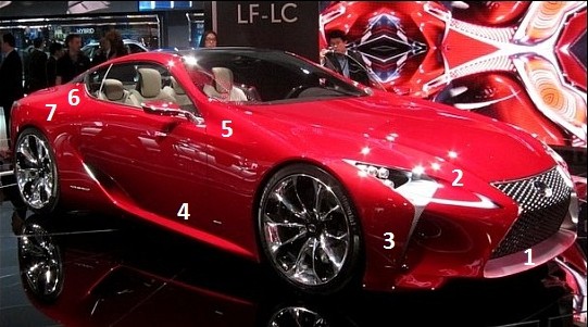
Front 3/4
 1: This new and bold grill makes a major statement, and to my eye, it’s the concepts only flaw. A 7/8 version, with less setback would have been better, but I understand Lexus’ goal here: prepare the public. That it does. This is what Lexus calls it’s “spindle design”, and they are currently incorporating it in the existing product lineup. My first thought was that it aped Audi’s large grill, but really, it’s not like Audi invented the form either. It’s an important move for Lexus, because while they’ve been hugely successful at creating a corporate identity (“The relentless pursuit of perfection”), their designs have been a bit generic, and lacked a strong family resemblance. BMW is the classic example of a grill that is instantly recognizable, and this graphic is unique, and should adapt well to the model line. Closer examination reveals a classic designer trick, the adaption of a form into another form. In this case, it’s the Lexus L, linked together and reversed in places, to form the grill “screen”.
2: The headlight area is sculpturally complex, and extremely well resolved. While pearl red is a dramatic color, it’s difficult to photograph, and surfaces can get lost. Pity, because the work in this area deserves to be seen and appreciated. The “L” theme repeats here, in the form of daytime running lights, as well as the inverted L of the stainless light opening trim that tapers to a delicate point just above the lower stylized ‘splitter’ element, while framing an air intake. The day time running lights (DLR) run through the larger element reminding one of a stream of liquid. While some show cars, like the NSX revealed just across the Detroit show floor have ‘lights’, they rarely function in any meaningful way. These look like they could be production ready very easily.
3: This front fender form is graceful, yet forceful, a nice trick, considering it lacks any bone lines. Note that it’s form echoes and supports the spindle grill opening. (As does the shape of the DRLs.)
4: This lower form anchors the car to the ground, and allows the door to be less slab sided, and lighter appearing. It also introduces the eye to the lower air intake. Nothing new here, but it’s handled cleanly.
5: Designers can choose to ignore realities of the world, such as pedestrian safety regulations, human packaging concerns and the like, but for the most part, the designers at Calty seem to have given real world realities at least a passing nod. A current struggle in sportscar design is how to handle the larger front volumes forced by regulatory issues, yet maintain a low roof height. The classic “canopy on fuselage” has been discarded, with the greenhouse being incorporated into the body form, and this is a great example it can be accomplished. Note that the cowl is higher than the window beltline, yet the form is balanced with the upturned beltline behind the door as the form rises to the roof structure.
6: If the car is produced, I hope this area makes it to production with little change. Note how the weight and bulk rest in a comfortable relationship to the rear wheel opening. Lexus is quite proud of it’s “Pillar-less” roof design. Barely visible from this view, the side window glass morphs into the rear glass and eventually the roof, which is glass as well, and then continues into the windshield. The point at which the beltline breaks and falls backwards is positioned well. Tasty.
7: Pininfarina designs from the 60’s Ferraris had delicate peaks to what, upon casual glance, were rounded fender forms. But look closer, and there was a tautness and crispness afforded by a very subtle peak. Here we see a similar touch, a delicate break to control reflections and visual weight. Starting from the taillight trims forward point, it fades as it flows further forward into the door.
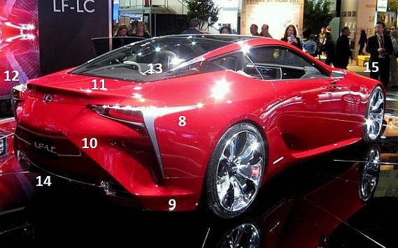
Rear 3/4
 8: The “L” makes another appearance, in a bookend trim piece, this time anchoring the taillights and forming the rear quarter edge, as well as defining an air extraction tunnel. Note how the tunnel is essentially a repeated form of the front air inlet.
9: A bone line that picks up the rocker “shelf” under the door.
10: While the rear lacks a bold grill element, the designers still managed to repeat the spindle form. (Remember, the spindle is two opposing “L’s”, rendered at 45 degree angles.) At first, it could be considered a bit forced, but notice how it resolves the inside tip of the taillights, serving to break the lower side sill from the rear lower valence area, and defines the extraction openings inner edge.
11: While some might object to a spoiler, and question its need, cars like the original Audi TT showed that they are often a required component. This one looks like it was pulled from the body and formed like a bit of taffy. It’s weight, and placement work well with the lower form and the trailing rear window. Hopefully, it will be appropriate after wind tunnel testing, should Lexus green light the design.
12: It has become nearly standard practice to use protruding light forms to create visual mass. When viewed from the far side, it’s apparent that the taillights and the stainless trim are important visual elements, emphasizing the designs “hips” and width. I’ll let Lexus’ references to how the taillights resemble jet afterburners slide as PR influenced hyperbole. But that doesn’t mean I don’t appreciate the depth of the internal lighting elements.
13: Lexus was rather vocal about this area. I wonder if they were just wanting an obvious talking point, or whether the designers really felt this element was that original. It’s certainly not the first time we’ve seen a ‘pillar-less’ design such as this where the glass is continuous from the side windows into the roof form. Jaguar has recently been painting their C pillars black to unify the rear window and side glass, with varying success, and other cars, like the old Ford Probe pop to mind as well. Regardless of it’s claimed originality though, I find this to be a most successful application. Carrying the body color and quarter panel form up to the rear window would have changed the graphics drastically, and created a very overweight area while moving the visual mass rearward excessively. The designers did make an unusual brushstroke though, in the application of the stainless trim that runs along either side of the roof glass. It’s form is related to the other stainless bits, coming to an elegant point at either end.
14: It seems that no car is complete without some nod to undercar air diffusers, but Lexus avoided getting carried away. In fact, the lower trim is a nice termination of the rear forms, and adds visual width, while adding dressing to the functional tailpipes.
15: Finally, note how the fender form is so dominant, emphasizing the cars sporting nature. Using the bonelines that originate at the upper corners of the grill and flow into the A pillars as visual breaks helps lower the visual height of the front form. If car makes it to production, lets hope the designers can keep this tight surfacing. Also note the very subtle break that flows backwards from the top of the wheel opening, and fades into the door, above and parallel to the similar break emanating from the taillight trim. A cohesive touch, reflective of the whole design.
It’s a design that rewards continued study in ways few do. It’s forms and elements repeat in appropriately subtle fashion. It defines a new design identity for the company to incorporate in their products. It drew significant attention…and praise, and I’d wager it is an investment that has already paid off. Whatever Lexus’ goals were going in, it’s hard to accept they haven’t met them, and more. Well done, Lexus.
Additional photos of the Lexus LF LC can be seen here.


